New Brand · Digital Rollout · Rebranding Strategy
OneCandid — building a unified identity from a landmark merger
When Foundation Center and GuideStar merged to form Candid, two of the nonprofit sector's most trusted names became one. I co-led the rebrand and guided the redesign of every digital property, email template, deck, report, and piece of organizational collateral.

The context
Founded in 1956 and 1994, Foundation Center and GuideStar — together holding the sector's most comprehensive nonprofit and foundation data — merged in February 2019 to form Candid.
"I had never fully appreciated how much a good branding process can contribute to culture. Having a new brand gave staff an identity, a look, and an ethos to which to aspire."
— Bradford K. Smith, Candid's founding presidentMy role
I worked directly alongside Open throughout the identity development process — not as an implementer handed a finished guide, but as a co-lead shaping decisions from the inside. Once the "How to Be Candid" style guide was established, I led the full digital translation: every web property, every email template, every presentation deck, every printed report and flyer.
The combined organization ran more than 40 web properties across four incompatible CMS platforms — EZPublish, HubSpot, WordPress. The style guide was just the beginning — Candid's entire digital ecosystem needed a full revision and rebrand, starting with a single button and extending across every product, interaction, and communication.
Flagship Deliverable: candid.org
Two legacy websites.
One new home.
The biggest design challenge of the merger wasn't the logo — it was candid.org. FoundationCenter.org and GuideStar.org had separate audiences, separate navigation models, separate content architectures, and years of distinct user habits built in. Merging them into a single coherent destination meant making hundreds of decisions about what to keep, what to retire, and how to signal to both audiences that they hadn't lost anything.
The result was a ground-up redesign: one homepage, one navigation system, one visual language — serving nonprofit leaders, foundation officers, academic researchers, and policy advocates without fracture. The site became the primary public face of the new organization and the clearest proof that the merger had produced something better than either predecessor alone.
The broader system
Sub-brands without fracture
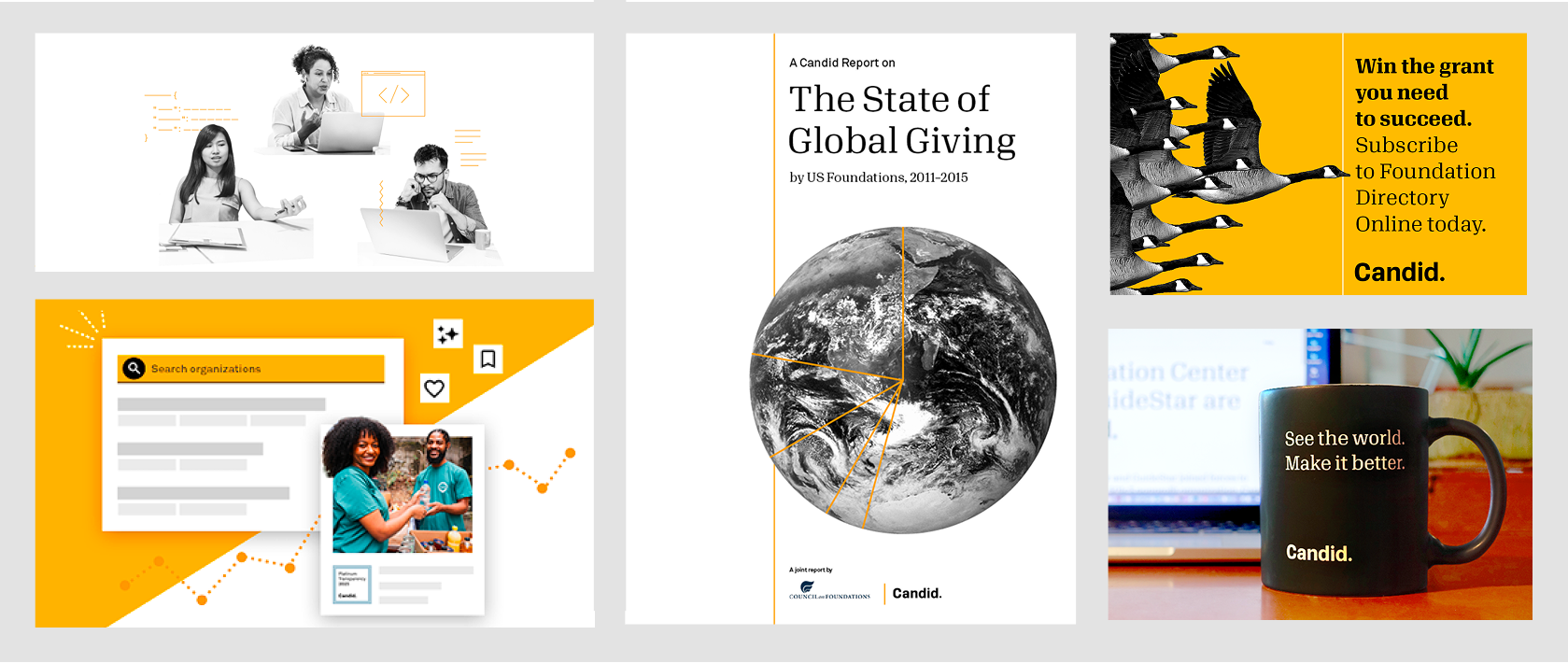
GuideStar and Foundation Directory Online had decades of recognition in the sector. Both needed to survive as product sub-brands while Candid became the institutional umbrella. Getting that hierarchy right required careful decisions about co-branding, domain strategy, and rollout sequencing. Sub-brands brought into the system included GuideStar Search, Philanthropy News Digest, IssueLab, Candid Learning, and the Developers portal.
One design system for four platforms
Rather than build separate pattern libraries per product, I drove the decision to define a single source of truth — a component library built in Adobe XD that established canonical behavior regardless of the CMS below it. Material-UI's organizational conventions gave it structure; Candid's identity gave it character.
Every touchpoint, not just the flagship
The rebrand extended to the full suite of organizational communications: email templates across multiple audience segments, slide deck masters, data reports and annual publications, event materials, partner-facing flyers. Brand cohesion at this scale lives or dies in the collateral — the documents that reach funders and partners long after any website update.
What I learned
A rebrand at this scale is infrastructure work. The visual identity is just the visible surface; what makes it last is the system underneath — the detailed specifications, the templates, the component library, and the processes that allow anyone in the organization to produce a compliant one-pager, email, or report years later without needing to call design. It requires careful planning, coordination across multiple teams and departments, rapid decisions in ambiguous situations, and ongoing alignment with leadership to ensure consistency, accessibility, and usability at every touchpoint. Building that infrastructure, not just the identity, was the real deliverable.