PulseIQ
An AI-enhanced fitness and wellness app designed to help users build sustainable healthy habits through personalized workout prescriptions, adaptive coaching, and empathetic progress tracking.
Discovery
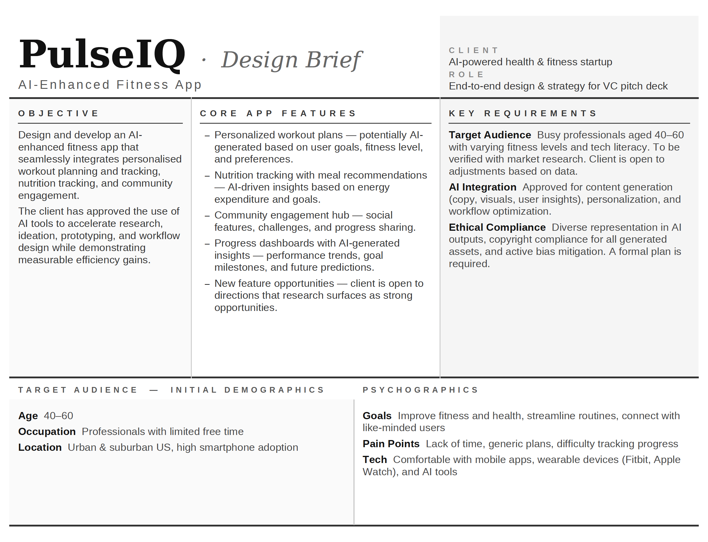
The Brief
PulseIQ is an AI-enhanced fitness and wellness app designed to help users build sustainable healthy habits through personalized workout prescriptions and progress tracking. It combines smart onboarding with adaptive coaching to meet users at their current fitness level.
The central design challenge was to make AI-driven guidance feel supportive rather than prescriptive — translating complex personalization logic into moments that feel human, empathetic, and trustworthy.
"Help people train smarter, not harder — and never make them feel like they're starting from zero."
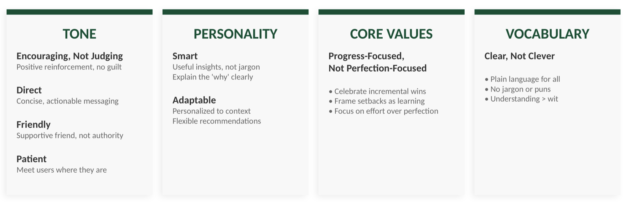
Brand Voice
Before any interface work began, I defined PulseIQ's brand voice as a design constraint — a north star for every content decision, from onboarding copy to AI coaching messages.
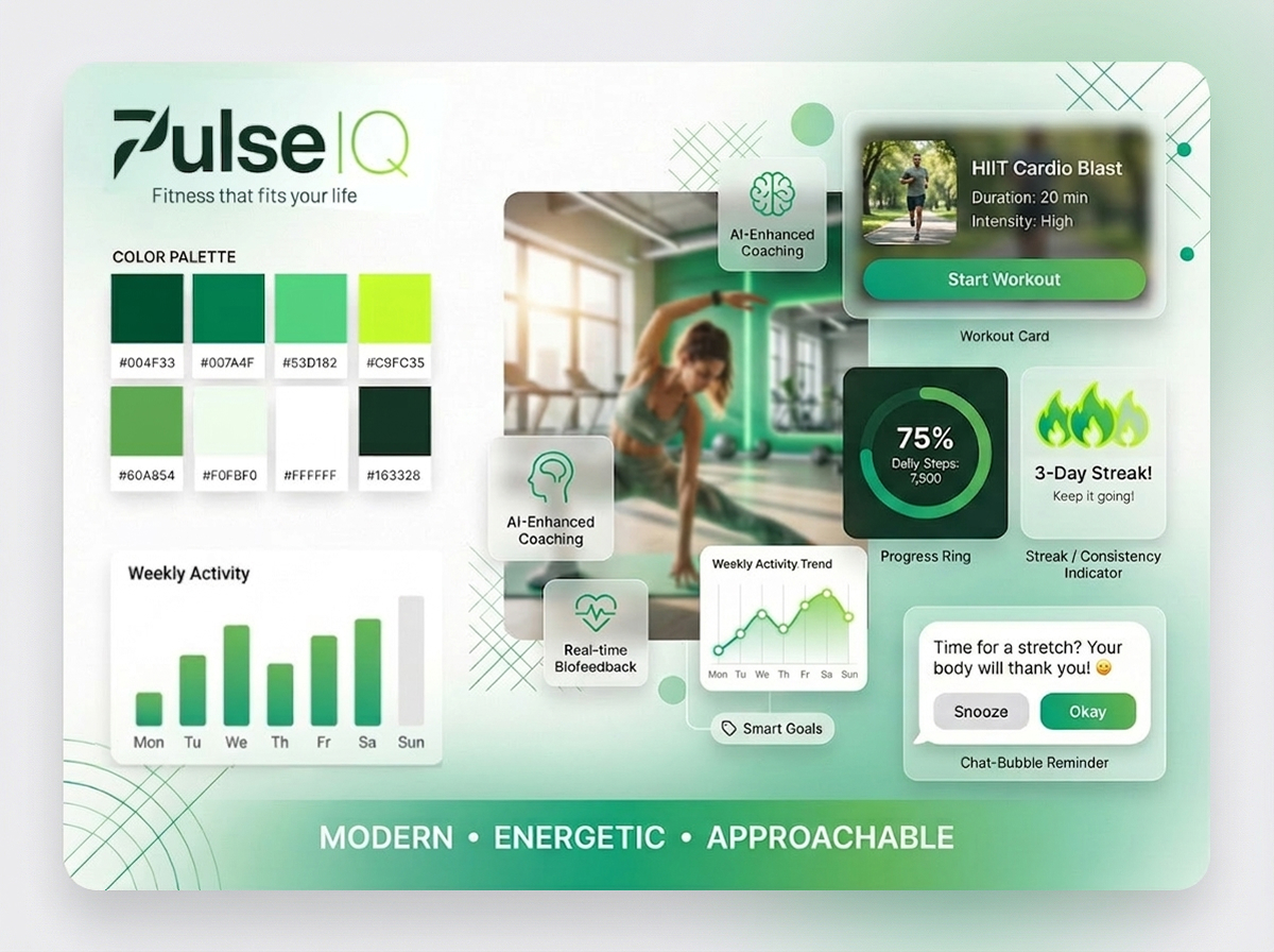
Visual Identity & Moodboard
PulseIQ's visual identity was designed to support clarity, motivation, and everyday usability. A green-forward palette, rounded components, and soft depth were chosen to create a calm, approachable environment — deliberately avoiding the dark-neon aesthetic that dominates the fitness app space.
Brand elements and UI patterns were developed alongside user goals: reducing intimidation, reinforcing progress, and making guidance feel supportive rather than prescriptive. Modular cards and data visualizations prioritize scannability and quick comprehension.
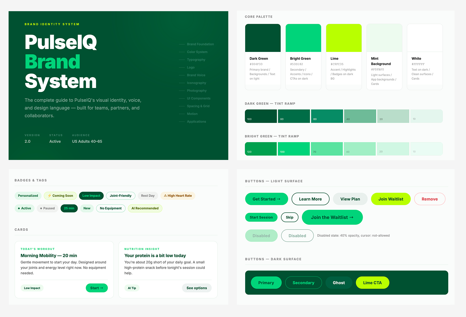
Brand System
This brand system documents the complete visual and verbal identity for PulseIQ. The work covers foundations through to interface — color palette with tint ramps and semantic tokens, a nine-level type scale, logo usage rules with clear space and minimum size guidance, brand voice principles with channel-specific tone guidance and a do/don't vocabulary guide, iconography, photography direction, a full UI component library, and a spacing and grid reference. The system was built to serve both design and development handoff: every section is precise enough to act as a production reference, while the interactive HTML format keeps it accessible across devices. The design decisions throughout reflect the core brand tension — clinical enough to be trusted by a health-conscious audience, warm enough to feel like a coach rather than an app.
User Personas
Three personas represent health-motivated adults aged 40–60 — a segment systematically underserved by mainstream fitness apps. Each maps to a distinct entry point into PulseIQ's onboarding pathway, with specific movement restrictions, clinical context, and motivational profile.
Market Research
I leveraged AI to analyze competitive landscapes and synthesize user research — uncovering unmet needs and stress-testing whether AI-generated outputs met inclusive design standards. The goal was to identify gaps that PulseIQ could own, not just match the market.
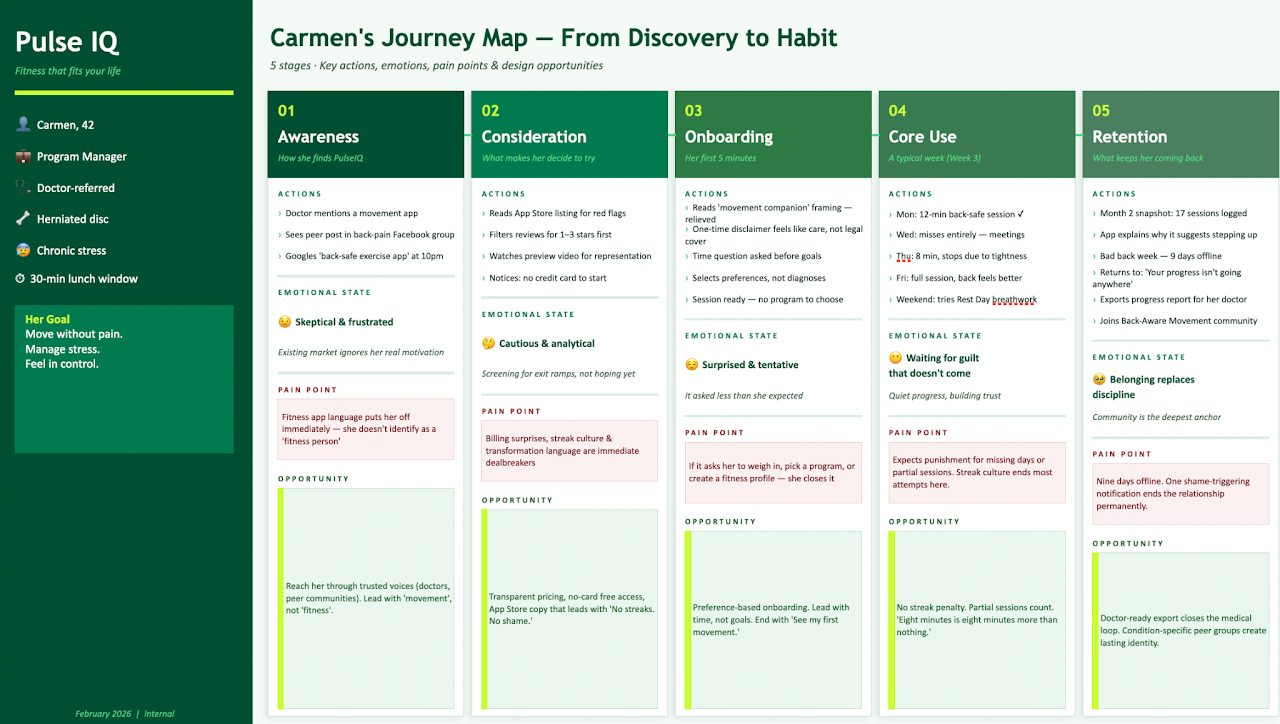
User Journey Map
A representation of the user's end-to-end experience — actions, emotions, and mental models at each stage. Mapped across Carmen's journey from initial awareness through the critical retention moment of returning after a missed workout.
Two key pain points surfaced from this mapping that became central design constraints:
Post-missed-day re-entry is a retention killer. Fear of "starting over" is strong. Micro-copy at re-entry isn't cosmetic — it's a conversion moment. The interface must communicate flexibility without abandoning the user.
AI recommendations feel arbitrary without visible reasoning. Surfacing the "why" behind suggestions isn't just about transparency — it's the mechanism by which users build long-term trust in the system.
Market & Feature Gap Analysis
A structured evaluation comparing user needs and competitor offerings — identifying missing or underdeveloped features across the fitness app landscape. This analysis directly informed PulseIQ's differentiation strategy and feature prioritization.
| Feature / Need | Zing Coach | Freeletics | Fitbod | PulseIQ Opportunity |
|---|---|---|---|---|
| Adaptive AI coaching (personalized to real-time feedback) | Partial | Partial | Partial | Full adaptive loop — plans evolve with every session and health signal |
| Health condition-aware workout modification | Partial | Gap | Gap | Onboarding captures health context; AI adjusts safely without requiring diagnoses |
| Non-judgmental re-entry after missed sessions | Gap | Gap | Gap | Designed as a core experience moment — warm, low-pressure, and built to bring people back |
| Transparent AI reasoning ("why this workout") | Gap | Gap | Gap | Explanations surfaced inline; users can understand and trust every recommendation |
| Integrated nutrition and fitness in one experience | Gap | Partial | Gap | Nutrition and movement connected in one view — no separate apps or subscriptions |
| Mental wellness and stress-aware programming | Gap | Partial | Gap | Mood and energy check-ins shape daily recommendations — the whole person, not just the workout |
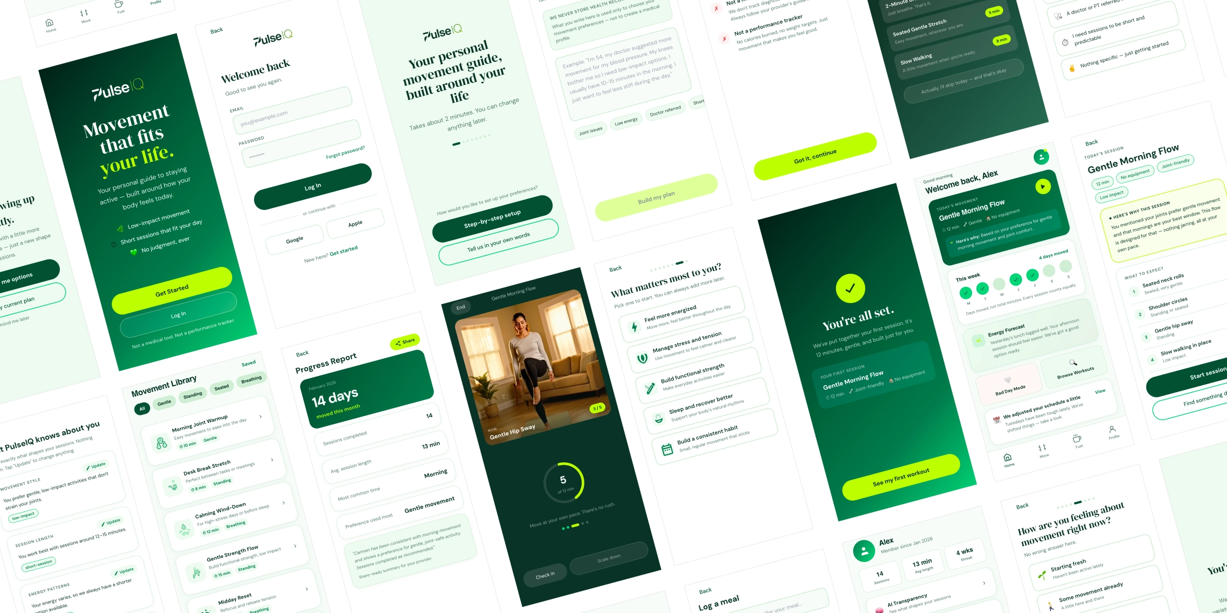
Prototyping & Testing
I used Claude Pro to create interactive, high-fidelity representations of the product — testing ideas, gathering feedback, and validating design decisions before any development investment. The prototype covers the full user journey across five core flows.
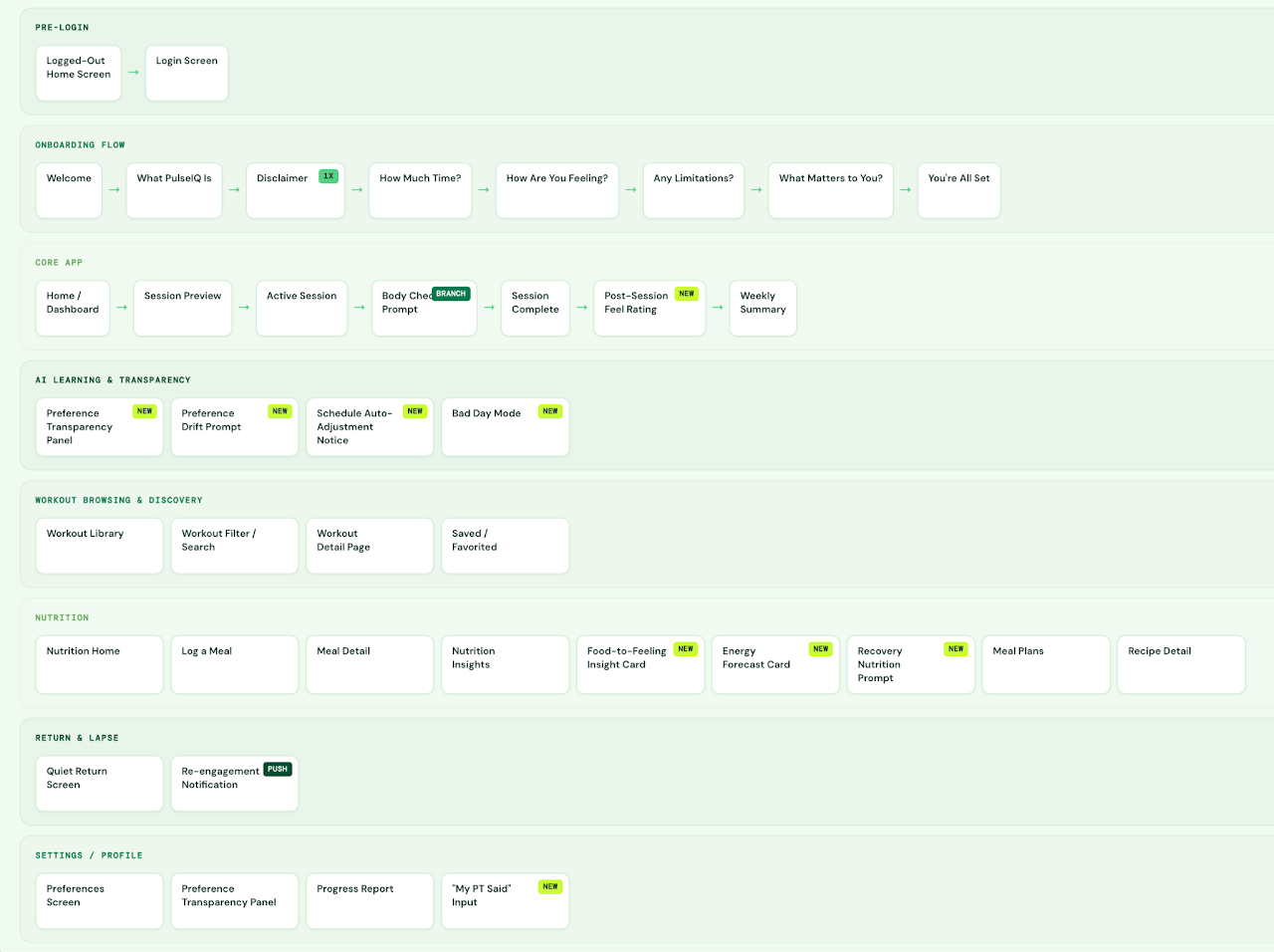
Screen Flow Diagram
Before building high-fidelity screens, I mapped the complete architecture: all screens, decision points, and navigation paths. This diagram served as the single source of truth for scope — preventing scope creep and aligning stakeholder expectations before design work began.
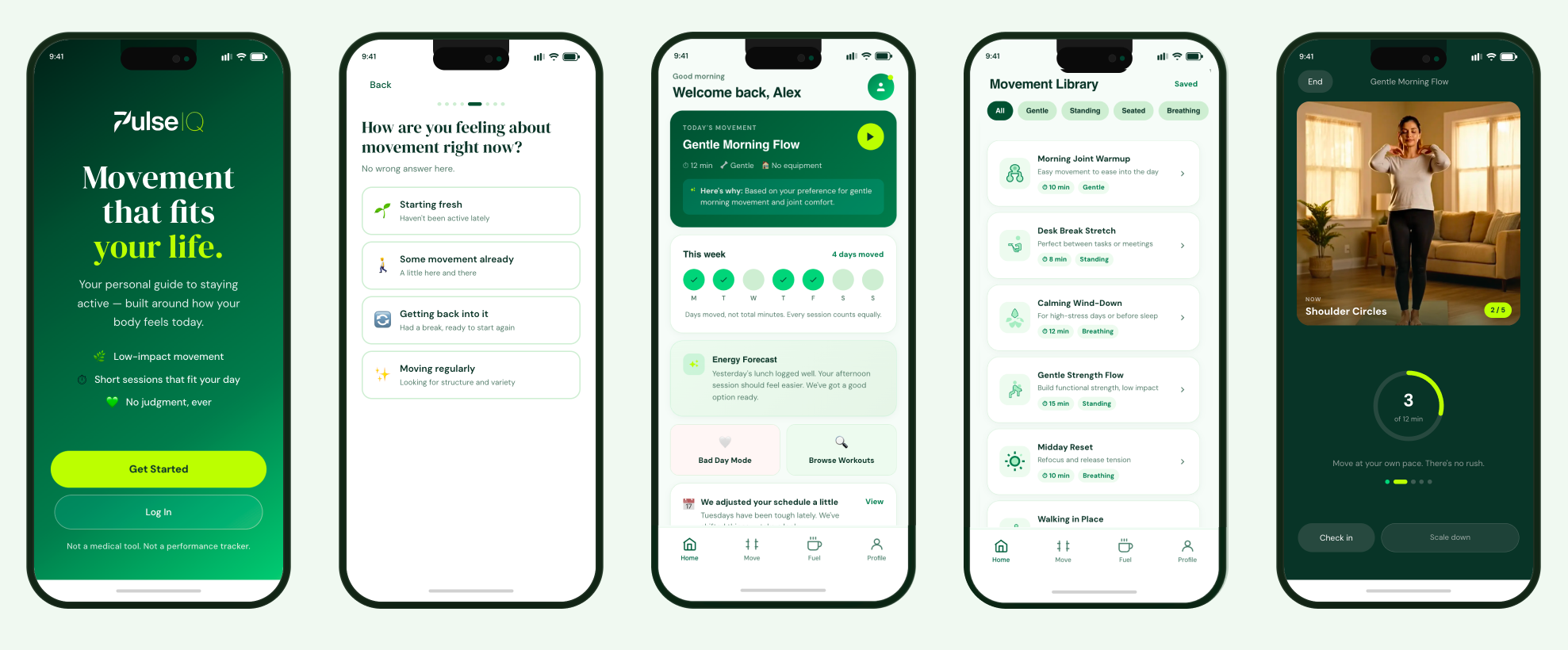
Prototype Highlights
The high-fidelity prototype brings PulseIQ's core user journeys to life in a clickable, phone-framed simulation. It serves as a design and communication tool — aligning on screen architecture, copy, and AI interaction patterns before any development begins.
Smart onboarding captures fitness level, goals, injury history, and schedule constraints. Users feel understood, not processed. No generic questionnaire vibes.
After each session, the app asks "How did that feel?" — not a rating, a check-in. AI adjusts the next workout based on real feedback, not just completion data.
Missing days doesn't reset progress. The app adjusts without guilt — treating gaps as data, not failure. Micro-copy at re-entry is deliberate and tested.
Every AI recommendation surfaces its rationale inline. Users can see why a workout was prescribed — building trust gradually rather than demanding it upfront.
Progress shown through consistency metrics, not just calories burned or streaks. The dashboard prioritizes the story of the week, not the single-session highlight.
All AI-generated content was audited against the bias framework developed in Phase 1. Tone, imagery references, and metric framing were corrected for diverse users.
Key Learnings
What AI Changed
Using AI throughout the design process — for competitive research, persona synthesis, moodboard generation, and prototype building — dramatically compressed the time between question and answer. But the most important skill was knowing when to override.
The AI's default direction for a fitness app was predictably "Tech Coach" — dark UI, neon green, high-energy sport photography. That direction was rejected in the first review because it defaulted to a young male athlete aesthetic that excluded the core personas. The brief explicitly called for "intelligently human" — and that required human judgment to define.
"AI accelerates the distance between idea and artifact. The designer's job is still to decide which artifacts are worth making."
What Didn't Change
Empathy can't be automated. The bias audit, the decision to reframe "missed days" as data rather than failure, the choice to surface AI reasoning rather than hide it — these were human design decisions grounded in the personas, not in AI-generated defaults.
The three things that AI couldn't do for this project:
Progress over perfection. No judgment. These were values — not features — that shaped every subsequent decision.
AI surfaced assumptions. A designer had to decide which ones mattered and how to correct them without introducing new ones.
The micro-copy for returning after a missed workout — that required understanding the psychology of habit formation, not just UX patterns.