Data Visualization · Mapping

Designing for data — four complex platforms

Making the nonprofit sector's most data-intensive tools legible, accessible, and useful — without making them simple.

Role
Research · Design · Front-End
Focus
Data Viz · Systems
Data-Rich Platforms

Data-rich platforms fail in a predictable way: they become accurate but unusable. These four projects — each at a different scale and for a different audience — share a common design challenge: build the hierarchy that tells users where to look first.
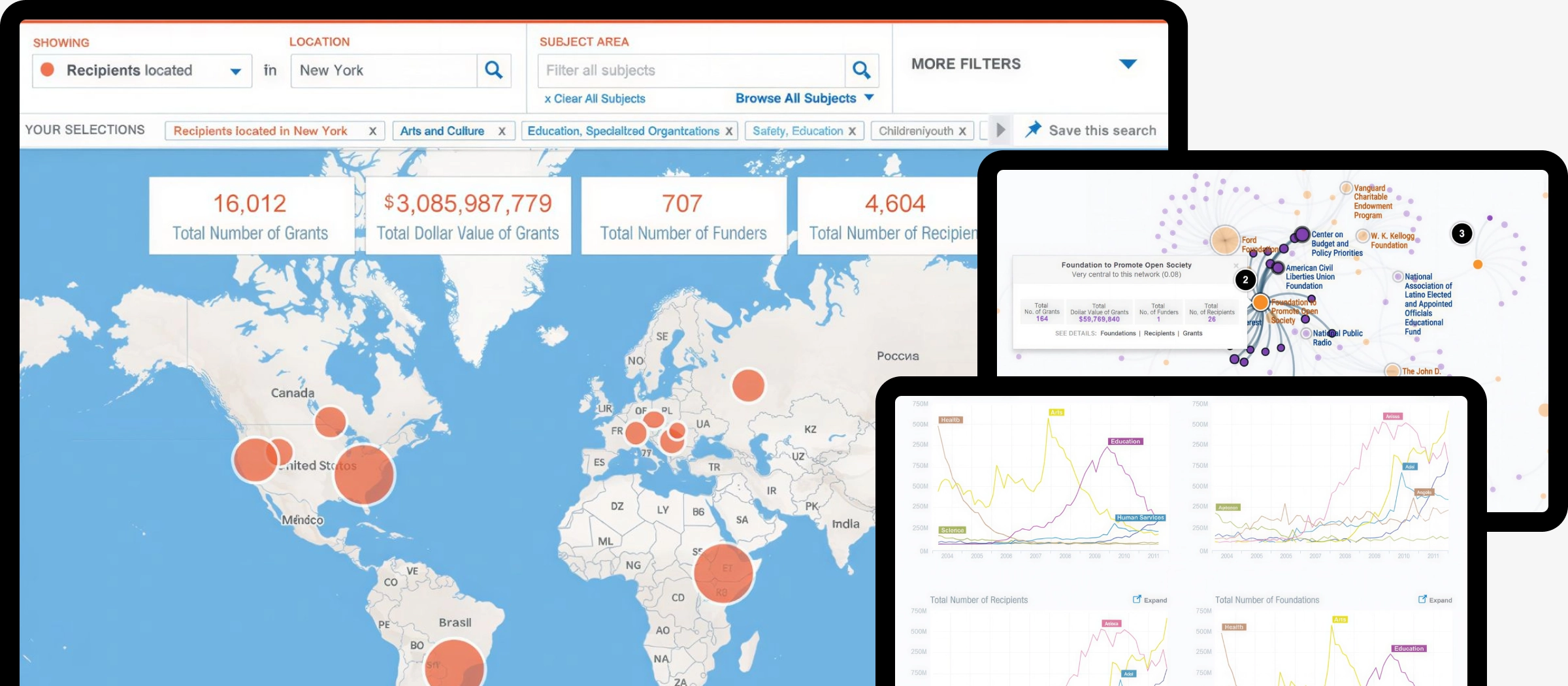
01

Foundation Maps

Visualizing where $180B in grants flow — geographically

Foundation Maps translates 13.6 million grants into interactive maps, network graphs, and funding flow diagrams — helping nonprofits identify funders, researchers study giving patterns, and foundations understand their own reach. I led research, shaped the interaction model, and contributed to front-end implementation across six distinct visualization modes: geographic map, Constellations network graph, Pathways Sankey flow, trend charts, sortable lists, and saved searches.
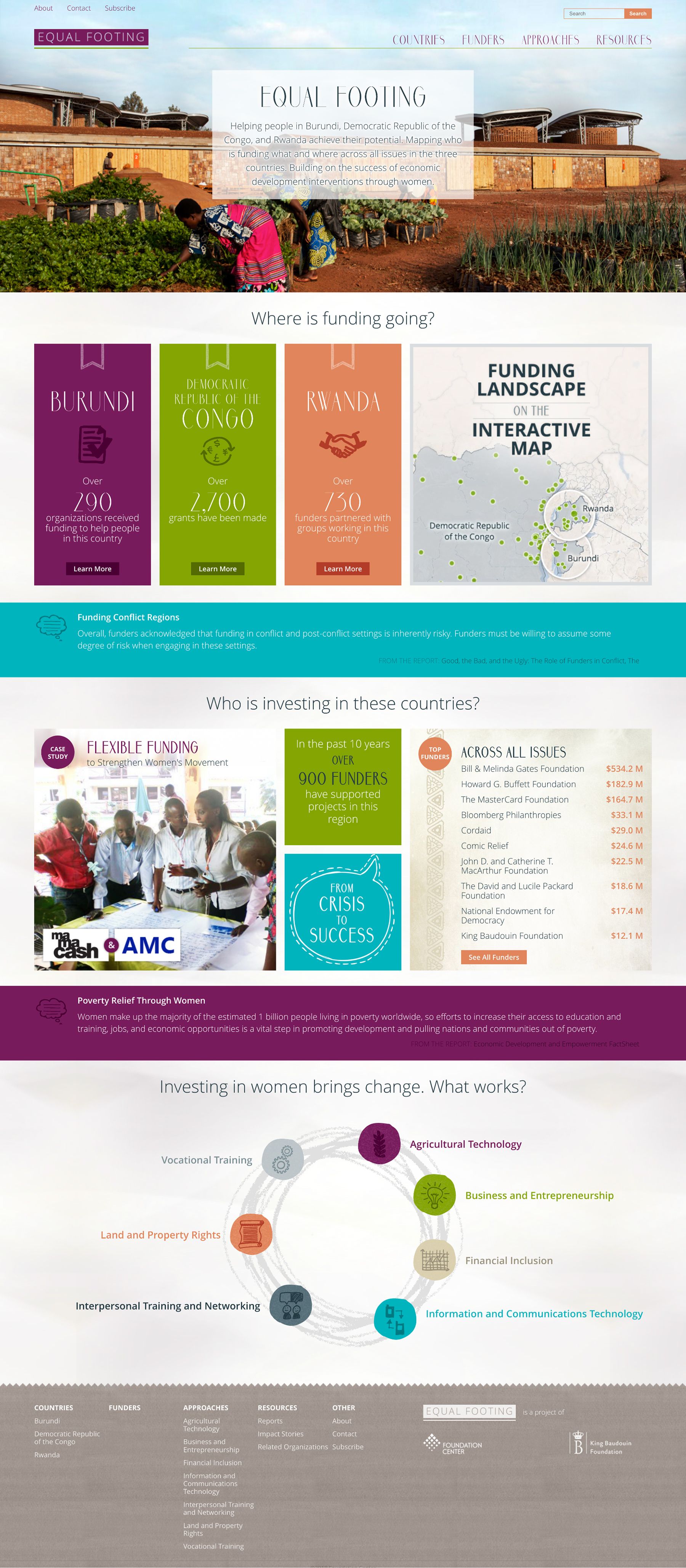
Design challenge
Six visualization modes — map, network, Sankey flow, chart, list, saved search — had to serve novices and power users from a single interface without fragmenting into separate products. Each mode revealed something the others couldn't; the design had to make switching feel obvious, not disorienting.
Key tension
Feature density was a trust signal for expert users but a barrier for first-time nonprofit grant-seekers. We resolved this through progressive reveal — advanced filters and boolean logic surfaced only after initial results were loaded, so the entry point stayed clean without hiding power.


Foundation Maps
02

Equal Footing

Mapping $1.3B in philanthropic activity across Central Africa

Equal Footing was a free international data portal — the first of its kind — mapping philanthropic activity in Burundi, the Democratic Republic of the Congo, and Rwanda, with a specific focus on women's economic development. Launched in 2015 in partnership with Bloomberg Philanthropies and the King Baudouin Foundation, it profiled 1,117 funders, tracked $1.3B in funding, and reached visitors from 143 countries. Built on Foundation Center's Foundation Maps infrastructure, it repurposed the same data visualization technology for a mission-critical, entirely free use case.
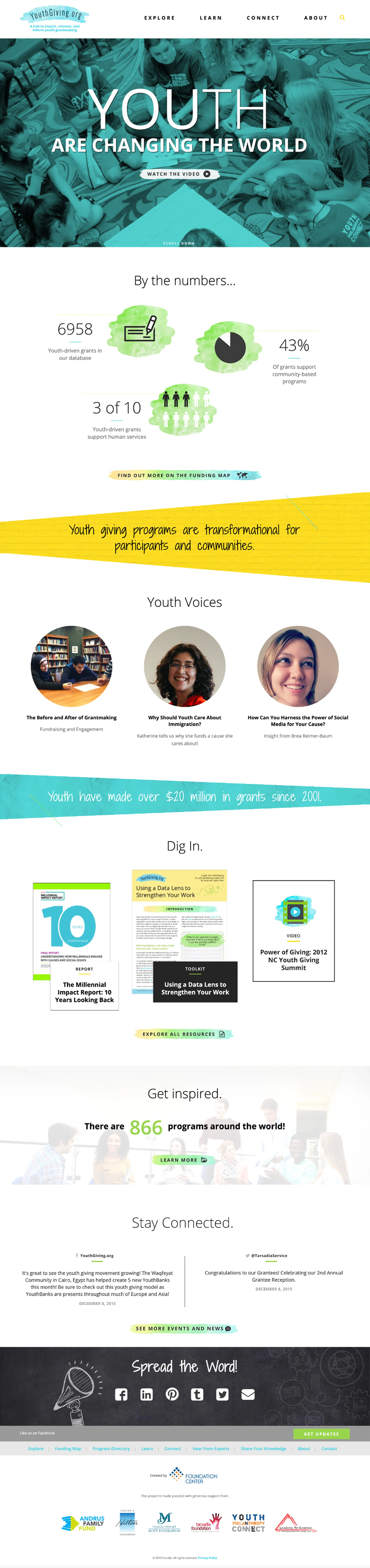
Core design decision
Where FDO and Foundation Maps defaulted to search-and-filter as the primary paradigm, Equal Footing led with geographic mapping and curated narrative content. The interface was built for users who didn't know what to search for — they needed context before they could form a query.
Information architecture
Reports were not raw documents — they were curated with extracted key takeaways, practical how-to materials, and case studies from the field. This editorial layer did interpretive work the map alone couldn't: turning data into guidance for practitioners with limited research capacity.


Scrolling mockup
03

Youth Giving

A community hub for youth grantmaking — 800+ programs, 143 countries

YouthGiving.org launched in June 2016 as a dedicated hub to inspire, connect, and inform youth grantmaking — a field that had grown to thousands of programs with no central resource. The site catalogued 800+ youth philanthropy programs worldwide, tracked $14M+ in youth-directed grants since 2001, and served a dual audience: young grantmakers aged 8–21 and the educators and foundation staff supporting them. It was funded by a $75,000 grant from the Frieda C. Fox Family Foundation, and grew directly from a Foundation Center landscape scan that identified the need.
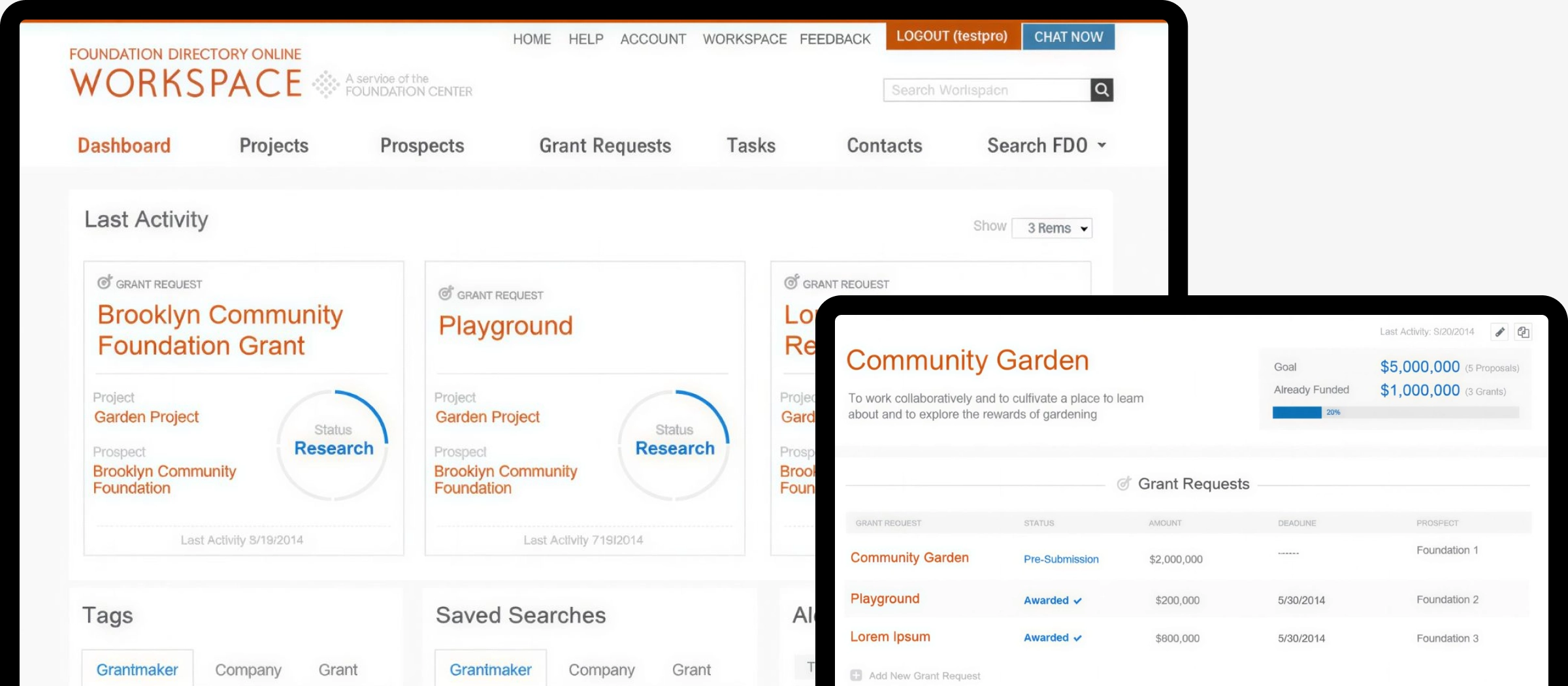
Information architecture
The site was structured around two distinct user intents: Explore (funding map and program directory for discovery) and Connect (blog, resources, and community tools for engagement). Separating these cleanly let data-seeking users and community-seeking users each find a direct path without the other mode getting in their way.
Branding decision
The site lived on its own domain — youthgiving.org — rather than as a subsection of foundationcenter.org. This was intentional: the youth philanthropy audience needed an approachable, peer-facing identity distinct from the institutional Foundation Center brand used by professional grant researchers.
Self-reporting model
The program directory was self-reported — organizations submitted their own entries. This democratized coverage (584+ US programs, 256+ international) but introduced data completeness gaps. The design had to present the directory as a living, community-maintained resource rather than a curated database — a trust framing problem as much as a UI one.


Youth Giving
04

FDO Workspace

Turning a research database into a prospect management workflow

FDO Workspace was not a separate product — it was the personalized dashboard and workflow layer built into Foundation Directory Online for paying subscribers. Features included saved searches with email alerts, prospect tracking with stage progression, a Projects tool that linked funders to specific funding needs, task management with deadlines and notes, and auto-identification of past funders by matching the organization's name against the grants database. It transformed FDO from a reference tool into something closer to a lightweight CRM for grant development.

Core design problem
FDO had been a database first and a workflow tool second for decades. The Workspace layer had to retrofit project-management logic onto an interface built for search and reference — without disrupting the primary research flow that existing subscribers already relied on weekly.
The export problem
The Workspace was used to organize research, but the output was almost always a spreadsheet. Sessions consistently ended in CSV export — users came to extract structured data, not to browse. Reducing export friction (fewer clicks, better column selection, persistent export settings) had more impact on user satisfaction than any search or filtering improvement.
Long-term stewardship
Working across five years of iterative development meant watching how design decisions aged. Features that tested well in isolation accumulated into interfaces that felt labored. That longitudinal view — seeing which patterns users internalized and where complexity compounded — directly informed the eventual consolidation into Candid Search.


FDO Worspace
← Previous
Next →